After a three-month holiday, Formula 1 teams launched their cars, moreover, fans have already seen all 10 liveries not only at official presentations also on the track during the pre-season test and every determined the favourite for yourself. Some liveries are overwhelming because they look gorgeous and stylish, while others evoke a spectrum of conflicting emotions.
Click here to subscribe to our print edition!
The fusion of history
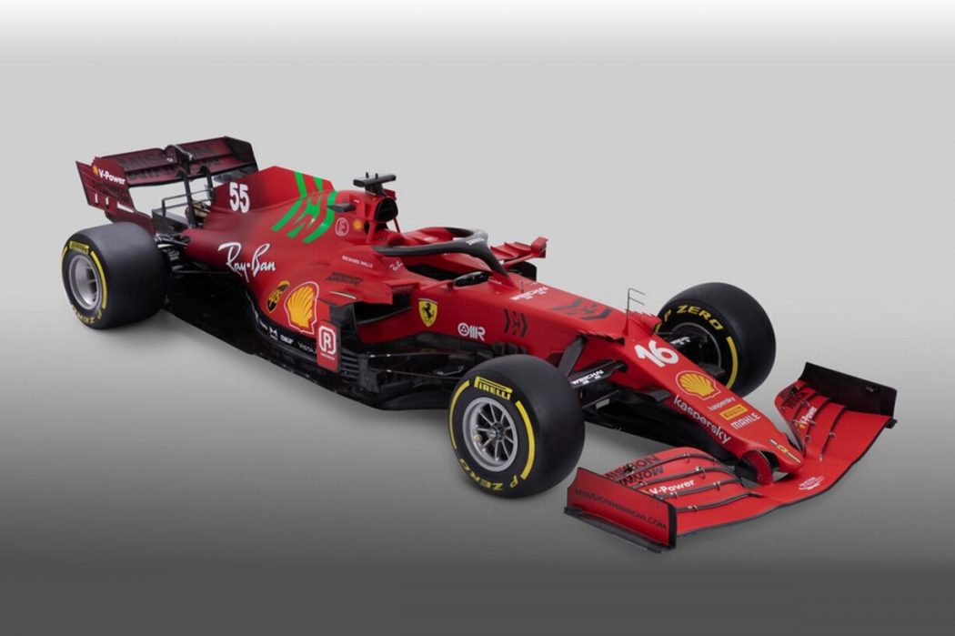
Combining two historic liveries, that have already been classics, in one is an interesting idea and a courageous step. In this season, two teams at once decided to experiment. Scuderia Ferrari, inspired by the success of the burgundy livery that was used to commemorate the Scuderia’s 1000th GP at Mugello, decide to combine it with a long-time known magnificent red colour.
Alas, the embodiment has failed, the harsh colour gradient looks like the livery from different cars. Also on the engine cover, there is a green colour for the Mission Winnow logo which does not decorate the car because of the strange choice of colour. High hopes did not live up to expectation.
Mercedes achieve the ideal epitome of the same concept by combining classic black and silver. Nevertheless, the livery turned out to be overloaded due to the new pattern consisting of the AMG logo and looks ridiculous.
The ideal needs no changes
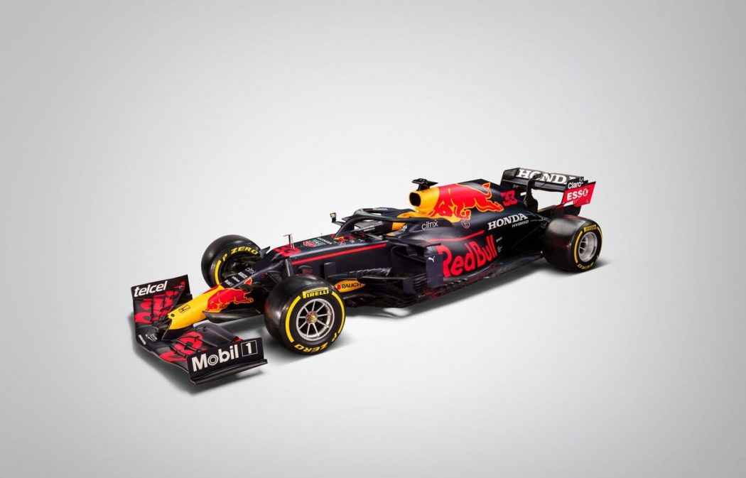
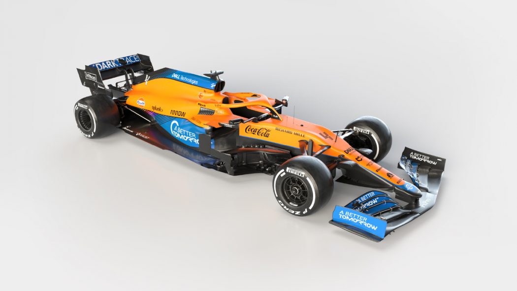
Red Bull Racing and McLaren do not change design for the third consecutive year. Both liveries are phenomenal, why modify something if it looks good. But when nothing changes for a long time, it gets boring.
The colour swap
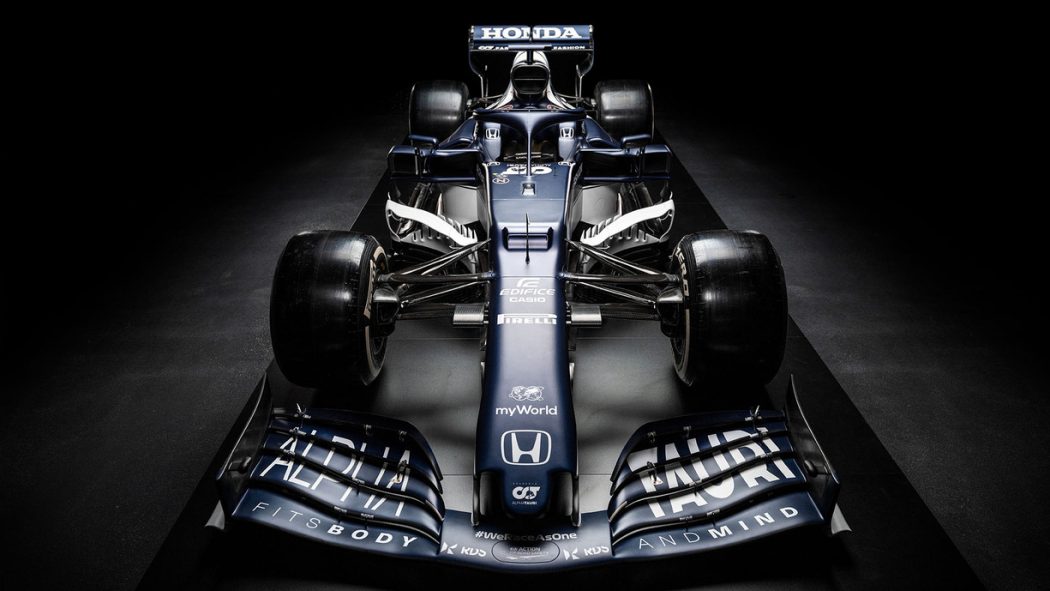
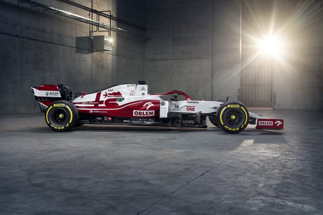
Beauty in simplicity – that’s what guides two Italian teams in the design of their liveries. In 2021, Alpha Tauri and Alfa Romeo decided just to swap colours compared with last year liveries. Alfa Romeo becomes more attractive and can safely claim the title of one of the beautiful car of 2021. Not sure that such a decision was good for Alpha Tauri, their previous livery was more impressive, although this car is a beauty too.
The concept of the national flag
Who did expect to see Russian flag livery before the start of the season? Right. Absolutely nobody. Haas F1 Team surprised every fan. Their design is most talked and absolutely no one is indifferent. The car livery caught the eye of not only fans but also WADA who investigated it due to the Russian flag’s ban in global sport, according to the last news, the livery is totally legal. With the new title sponsor UralKalli, the American team acquired Russian spirit, but their livery is ambiguous.
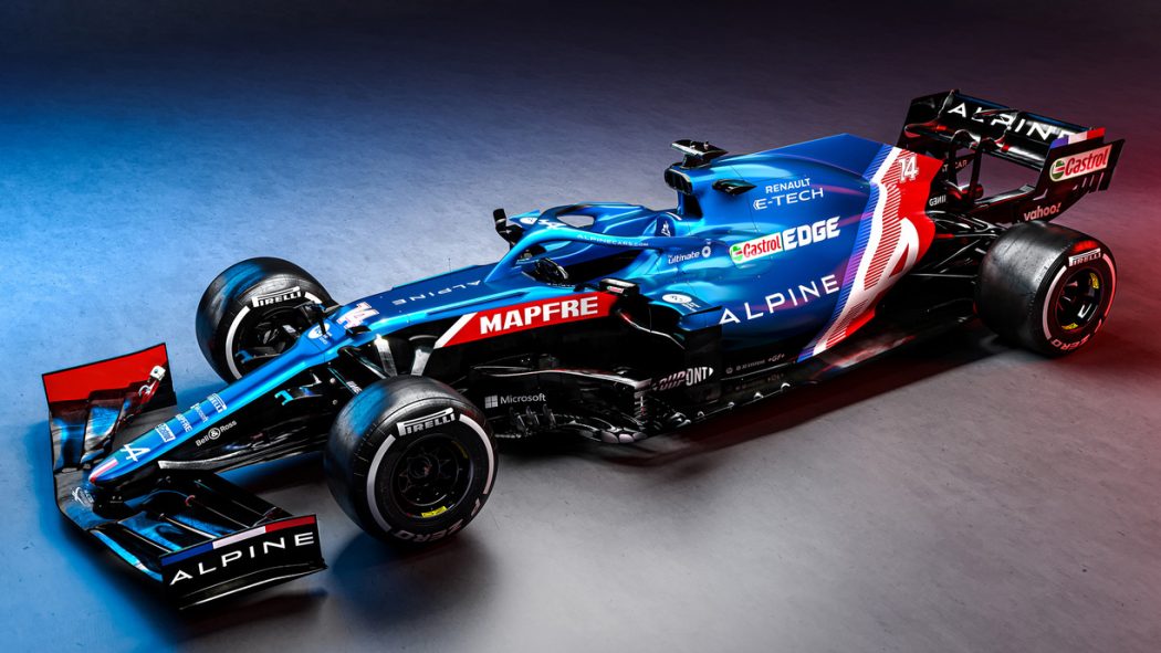
Alpine used the same idea and seems like they found a more interesting approach to the realisation, it is based on French and British flags. New Renault name and new phenomenal satin blue livery which looks gorgeous on tracks. Is it not ideal?
New vision
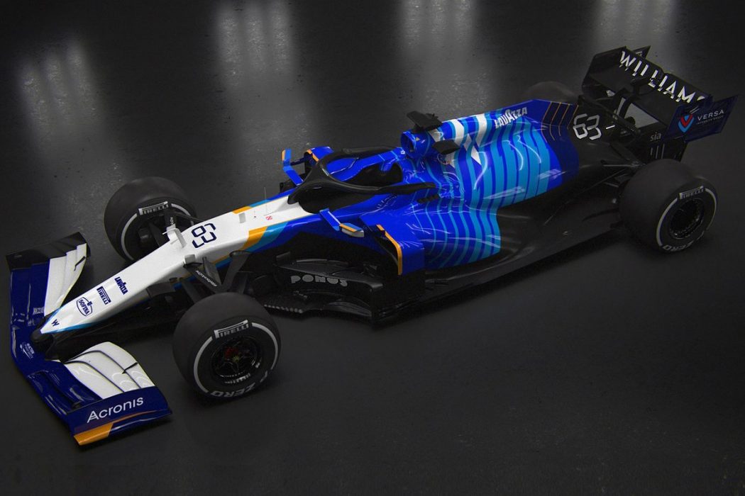
With new Williams’ management, a fresh car livery looks lame. This could be brilliant but the nose and front wing parts have to be improved. Against a stunning back car part with interesting modern shapes of yellow-orange and various shades of blue, the front looks faded.
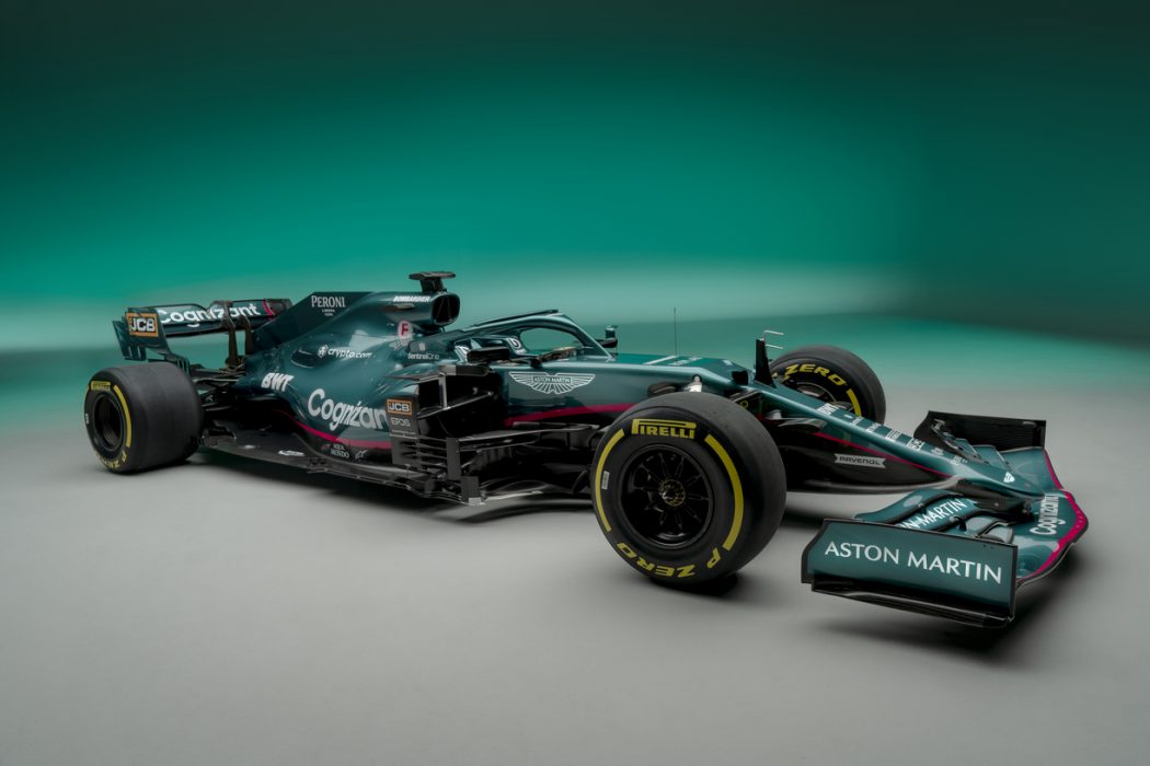
Another one that expected a new look was Aston Martin’s return to F1. Expectations were not in vain. British Racing Green livery, which is a nod to the classic Aston Martin racers of the past, turned out exquisite and stunning. Why has no one used this colour before? Special charm was added by small details as British flag badge in vintage style on the nose and pink strips appeared because of the sponsor contract with BWT. Fantastic detailed work and think it is the best livery of this season.




Related Articles