Paolo D’Alessio supplies various motorsport publications with articles and detailed technical drawings of Formula 1 cars. In 1993, he also founded an industrial design firm and since then has been producing watches, bikes, means of transport, helmets, sports glasses and other stuff for customers such as Momo, Martini & Rossi, Mazda, Honda, Diavia, Philip Morris, Alfa Romeo, Fiat, Ibea, Universal. We have Paolo to give us five ways to look at Formula 1 cars.
Click here to subscribe to our print edition!
1. Look beyond a beautiful car
Enzo Ferrari used to say that a Formula 1 car becomes beautiful when she wins. And he was right. Today the components which define the look of a modern Grand Prix car are not always related to technical issues. The current vehicles are not only a concentration of extreme technical solutions but a sort of technological sculpture or if you prefer, a fast advertising poster.
2. Examine the history
There have been cars that have become true icons in the collective imagination in every era, like the Mercedes W196 (1954), Lotus 72 (1970) and Ferrari 312 T (1975). Personally, rather than to a particular example, my preference goes to the whole 1971 season. The aerodynamics applied to those Grand Prix cars took its first steps in Formula 1 and the machines were very different from each other, making it a fantastic season for fans in a visual sense. The cars were very recognisable, while today they are, more or less, pretty similar.
3. Explore different liveries
Since the sponsors have made their appearance in Formula 1, there were some graphics that have transformed Formula 1 into a real modern “discipline” of art. The JPS Lotus of Emerson Fittipaldi and Mario Andretti, the Brabham with the colours of Martini Racing, the Ligier of 1993 with livery designed by Hugo Pratt, the 1979 Shadow of Jan Lammers, these are real masterpieces. More recently, I would say that McLaren and Red Bull are the teams that have presented the most appealing liveries.
4. Always ask for more
We surely can’t state that the current cars are among the most beautiful ones of all time. Too restrictive technical rules and exasperated aerodynamic research have produced quite unattractive racing vehicles. Even the liveries are not particularly nice to look at. The only innovation of some kind was presented by Red Bull, that in 2016 opted for the use of matte colours, while Ferrari, to renew its look, has even copied the design of the 312 T 1975! Even the “total black” livery of the McLaren does not seem attractive, not to mention the graphic design of the Renault 2016, one of the least charming cars I have ever seen in Formula 1. An important team like Renault could do so much better.
5. Know your picks
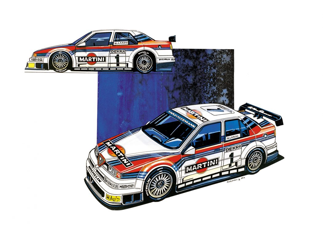
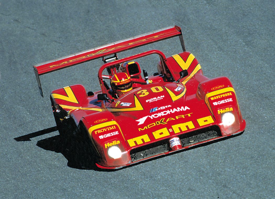
People often ask me what are the best racing liveries I’ve done in the past years. It’s difficult to answer that as I had to solve different problems for each car and for each sponsor. If I had to choose, I would pick these models: Lancia Deltas of Martini Racing, the 1994 Alfa Romeo 155 DTM and the Ferrari 333 SP. Regrets? In 1989 my great friend Gianpiero Moretti and I made a graphic suggestion for Ferrari to change the visual design of their Formula 1 car. Piero Ferrari, a great friend of Gianpiero, appreciated our work very much, but Fiat was not interested in changing the look of the “red car”. What a pity!


Related Articles